With much of the data in Brainnwave’s intelligence platform being geo-spatial in nature, country, region or area selection was always an important feature.
This is how I saw things change over 7 years of platform iteration:
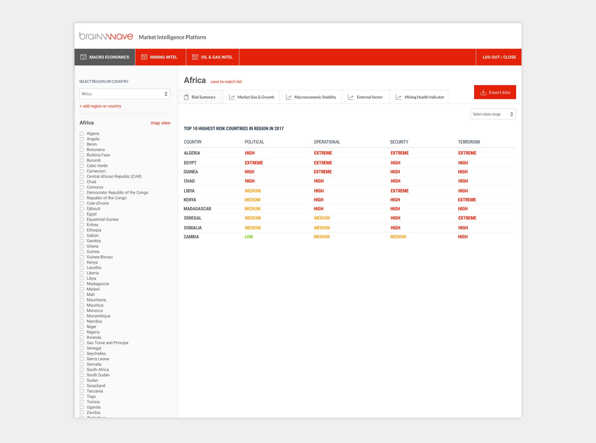
Before I started designing for the platform the country/region selector had been implemented by developers as a dropdown on the left hand panel, and selecting a region would populate a long list of checkboxes to work with.
Each new region would require a new selection to add. This was a somewhat lengthy experience, and would not be easy to manage from a UX point of view.
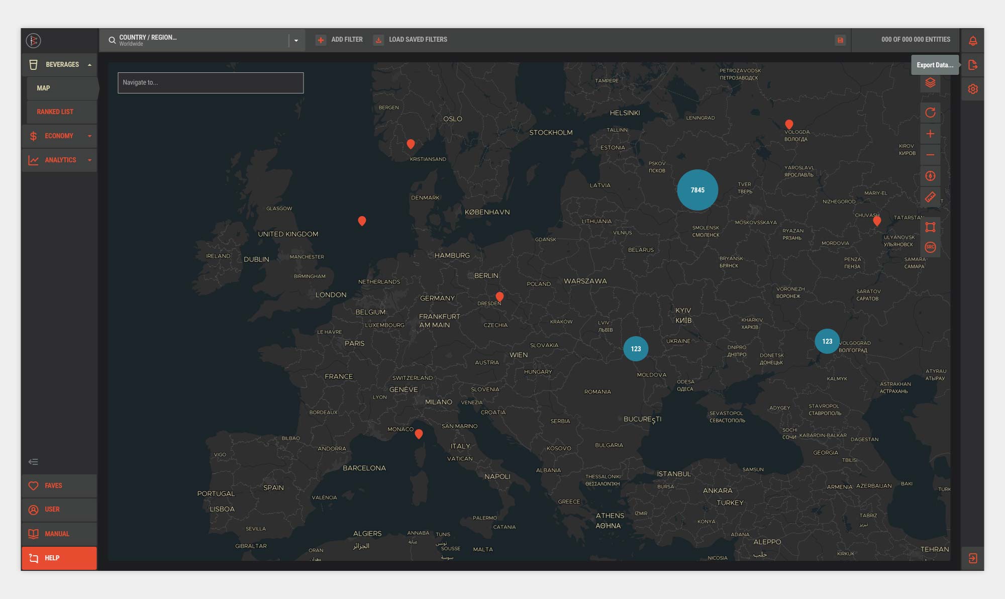
Because the area selection was what influenced the content across the entire platform, I suggested that we move that to the top bar and show it above the main navigation. It was a bold move and required a bit of convincing.
By default the platform would show data for worldwide, but the first step of any user’s process would be to make area selections, so it made sense that it be the first thing a user comes to on the page, and from an information heirarchy point of view, it controlled the platform at a level above the separate pages/tabs.
This also freed up the left hand filter panel for further filter options which wouldn’t take up so much vertical space.
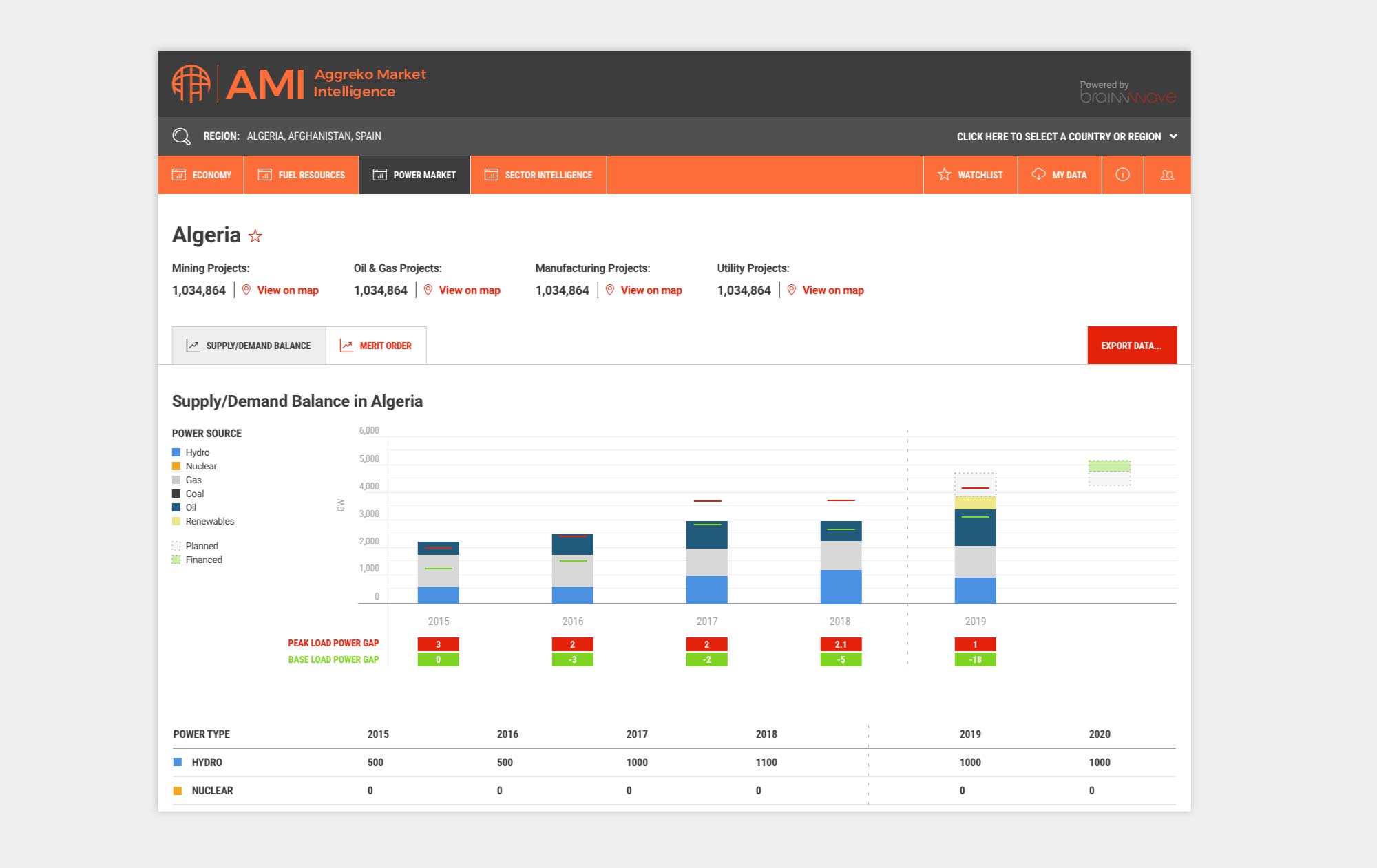
The issue here became vertical-space on smaller screens. The header was large, and in retrospect of course the logo was giant, but even reducing that to a shallower line wouldn’t fix the issue.
Our clients had started using laptops in the office, and so we had to look at condensing the top bar and reducing vertical height of elements which were sticky when scrolling.
I felt reducing the logo to an icon and running the selector along the top would help cut vertical header height.
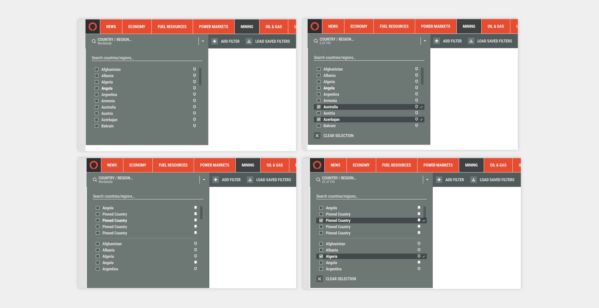
Management of so many potential regions, sub-regions and individual countries also meant trying a large multi-column expandable section.
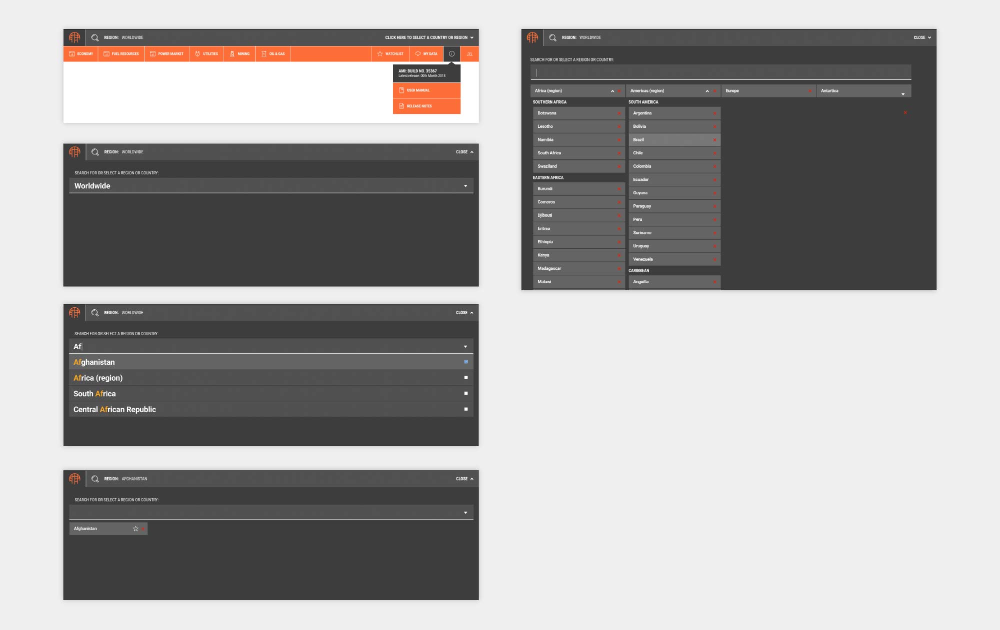
For a while this was a suitable solution and was flexible enough to be expanded out to different taxonomies for area selection.
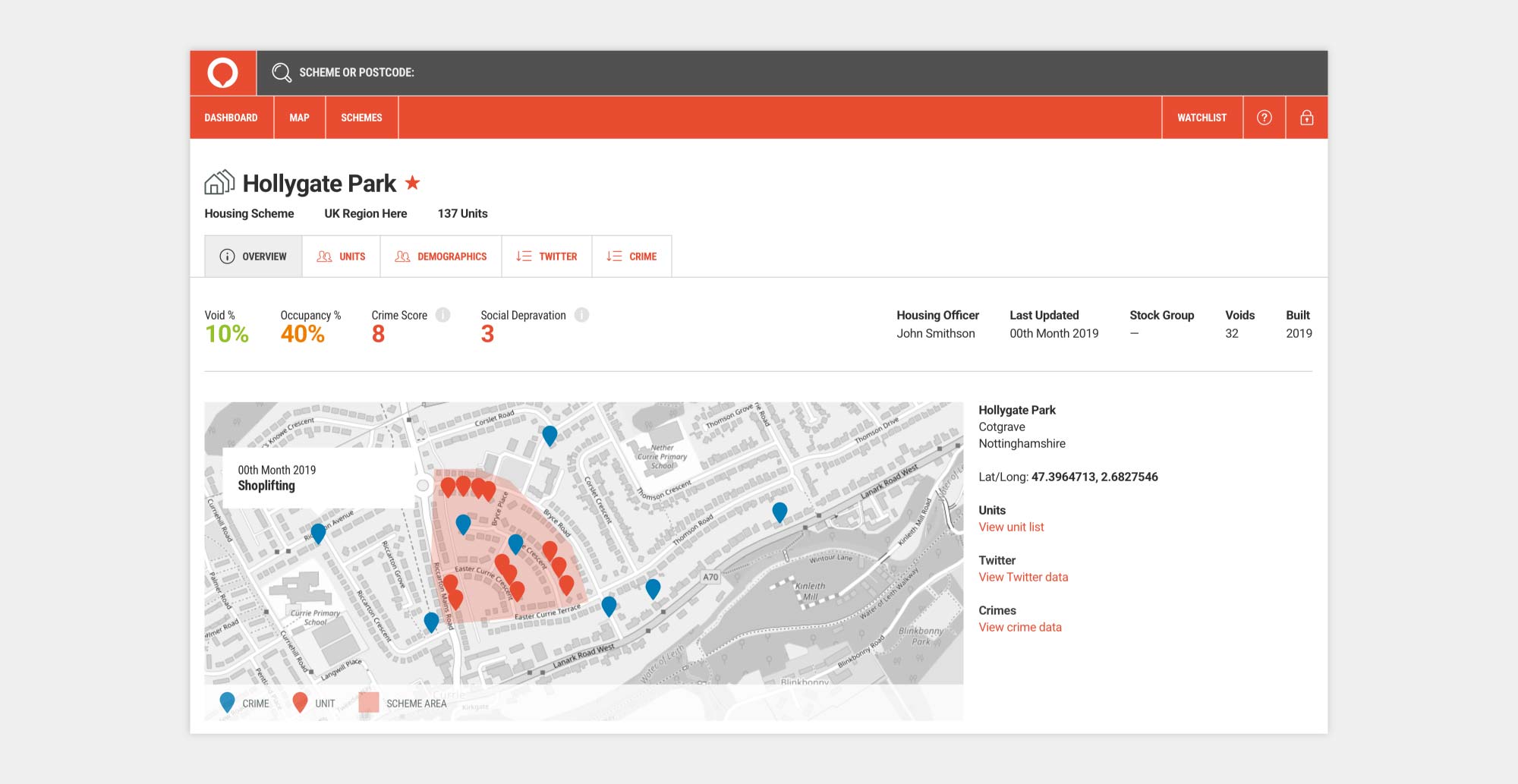
The platform could be implemented for different clients. The example below shows a housing association platform:
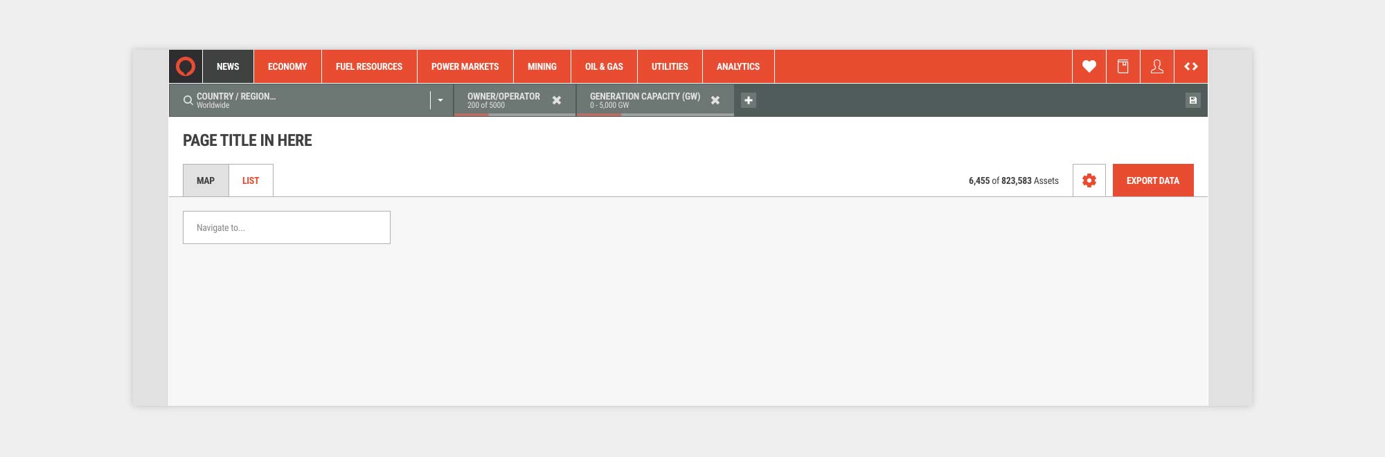
Over time we saw the structure of the platform change and with the rise of more filtering options across views, and heirarchy changing to allow different filters and area selections per platform section we shifted the country selector into a new filter bar which ran beneath the main navigation.
Each section could now have its own different area selections, as well as connected filter chains, so a technical and back-end change gave way to an improved user interface.
To account for long lists of countries and regions, we implemented a search filter at the top of the dropdown, and to facilitate ease of use, we added the option to "pin" a country to the top of the list, making it much easier to access.
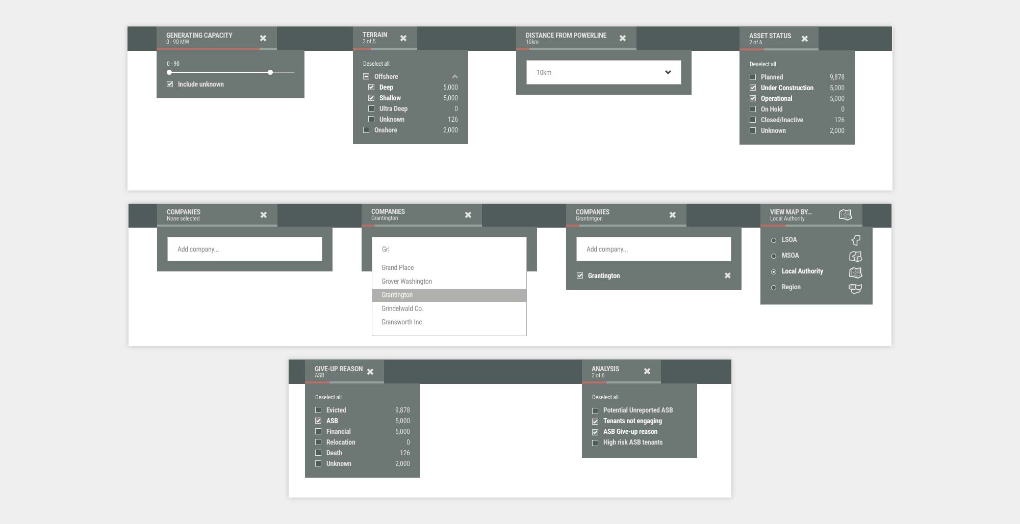
We also brought the rest of the filter designs in line to match the country selector so it felt more like a filter, and less like a separate section.
As Brainnwave evolved, and the company was re-branded, part of our discussions were around bringing the platform into line with the updated brand and instead of differentiating it with a separate name like Ossian or MIP, just call it “The Brainnwave Platform” and make both the brand and the platform visually similar.
With that in mind, I started to design an updated dashboard based around a larger working area for analysis and shifting tools and navigation to the very edges, both left and right as well as a top bar.
The country selection remained functionally the same, but would be nested at the top of the page.
It was at this point we also started to work collaboratively with Hatch, and so in a number of sessions, we shifted the direction of the platform and it was re-branded as a separate tool once again.
The Mosaic platform started to evolve and although the country selection remained similar in function, the structure of the platform had to change to accommodate different workflows.
The design also changed and Mosaic was branded separately with a new palette, logo, icons, type and overall style.
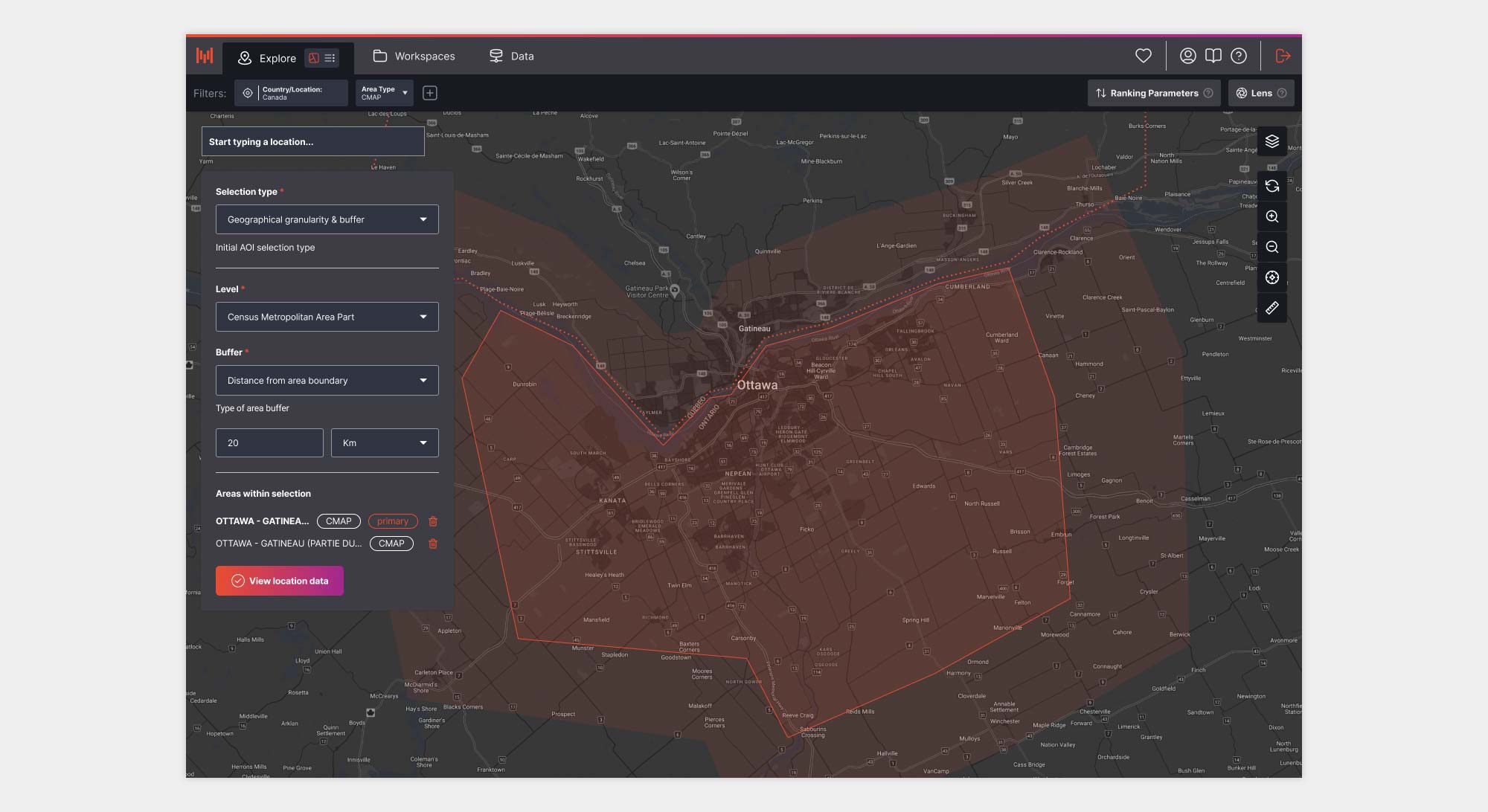
In fact, it wasn’t too long before the country selection stopped being a filter and began to work as part of a separate flow, where a user would select their area of interest and that selection would remain behind the scenes without the need to change.
And if you’d like to read about the Area Of Interest (AOI) Selector case study, that’s detailed here.
I think the ultimate learning here is that over 7 years a design will change as the business needs, client and users needs evolve. As a designer, there has to be a flexibility and a willingness to reframe design problems with renewed content, context and understanding.
Understanding information architecture, technical limitations, external branding and visual influence is crucial, but equally important is context and understanding how users are accessing the piece of design.
All of this plays into product design and yes, it might not always be right first time. An acceptance of design change has to be part of a product designer’s mindset. Even the best designs will end up developing and elements that influence that are more than likely going to be out of your control.