At Brainnwave, we were developing a platform called Mosaic to uniquely classify businesses based on how they describe themselves.
In a nutshell, the platform would analyse every organisation within a user’s selected area. Looking at the organisation’s website and online presence, and then collecting information and context about how that organisation classified what it does.
That information would then be plotted in a multi-dimensional vector space in order to determine clusters of similar businesses using how they talk about themselves to determine phrases, keywords and descriptions of their business activities.
These naturally occuring clusters would then be outlined as "Smart Sectors" and could be analysed in different ways.
The sales website (that I also single-handedly designed and built as well as wrote most of the copy for) is still online in order to help explain the concept in more depth.
You can also view the short clickthrough sales video I put together to show the platform:
The product had huge complexities under the surface, and would need to be built in a way that could handle different datasets, different types of analysis and different ways of showing the data.
Users would be familiar with NAICS or SIC industry codes for businesses, but would not be familiar with our own Smart Sector classification, since they would evolve naturally every time a user’s area was analysed.
User flows had been pulled together to show how someone might expect to use the platform, what they were hoping to get out of it, and their entry point. Those flows were combined with the development and delivery teams understanding of what was possible, the data science team’s opinion on how best to show the outputs from the model, and both sales and C-suite’s discussions with potential prospects about what excited them most.
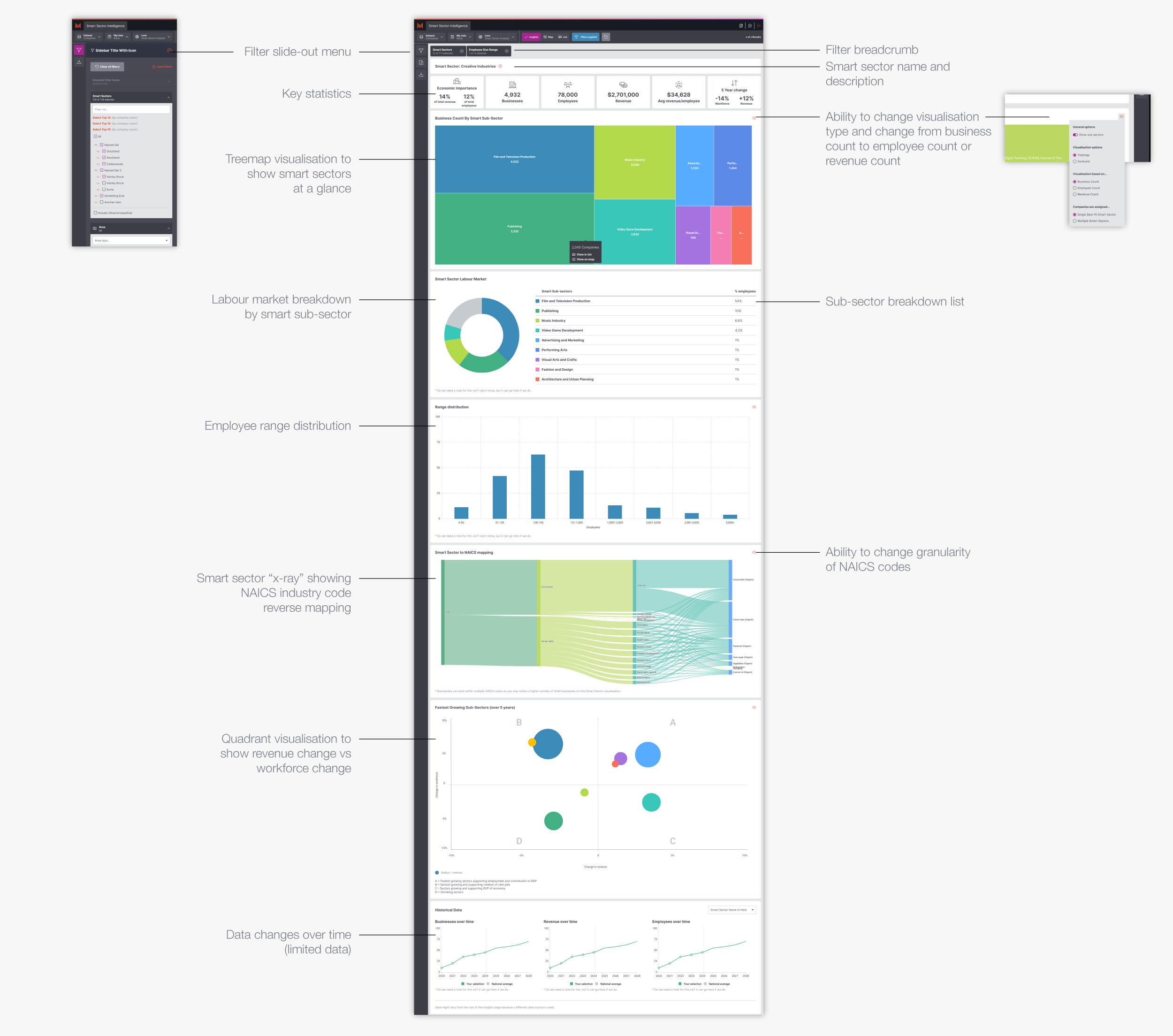
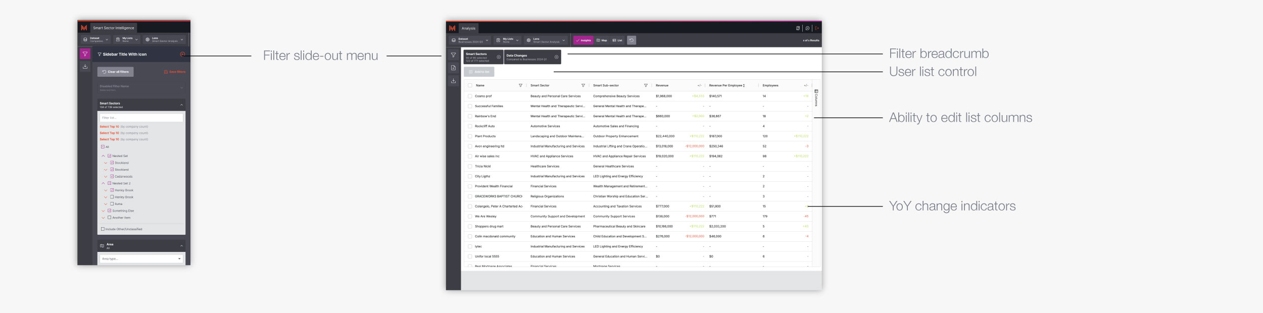
It was decided that simply put, our platform would essentially be "views on a set of data". The data in this case, being our analysis of businesses. That put the core dataset as companies with associated classification and meta-data.
There would be three main views of this data and analysis; Map view, List view and Insights view.
The most visually enticing view, this would pull together various visualisations built from the available data and anlysis.
A familiar Microsoft Excel style database view which gave users the ability to work with rows and columns to dig into relevant data as well as a flexible entry point to individual business pages.
A geo-spatial view on the businesses in the database, this would give users an idea of naturally occuring physical clusters of similar types of business. Whether that was start-ups or specific industries.
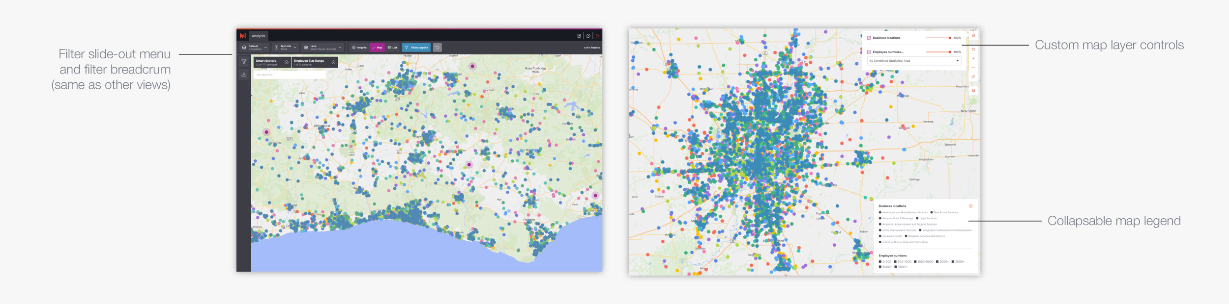
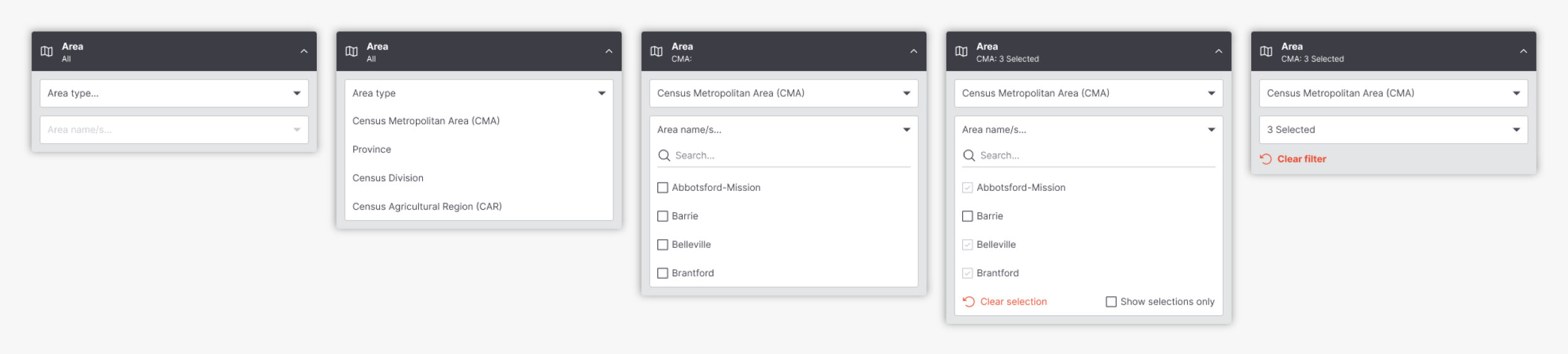
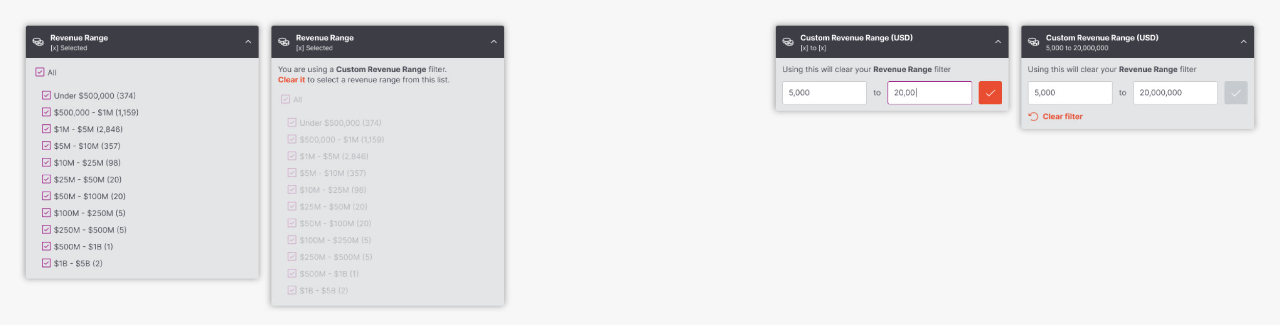
A set of cross-view filters were devised allowing the user to change how these views responded. This gave the user the ability to dig into businesses in certain sectors, certain areas, or filter them by employee numbers, revenue and various other meta-data metrics available to us.
These filters were often designed and implemented one by one, but would require consistent design patterns for various types of control.
A more abstract concept, lenses provided a way for the user to switch how they viewed the data. Was it Smart-Sector analysis centric, or NAICS-code centric? They could switch from a viewpoint of the entire economy analysis, or they could set up a number of keywords and measure each businesses relevance to a set of sectors that they defined.
This meant the lens control would have to sit above the views, but within the dataset heirarchy.
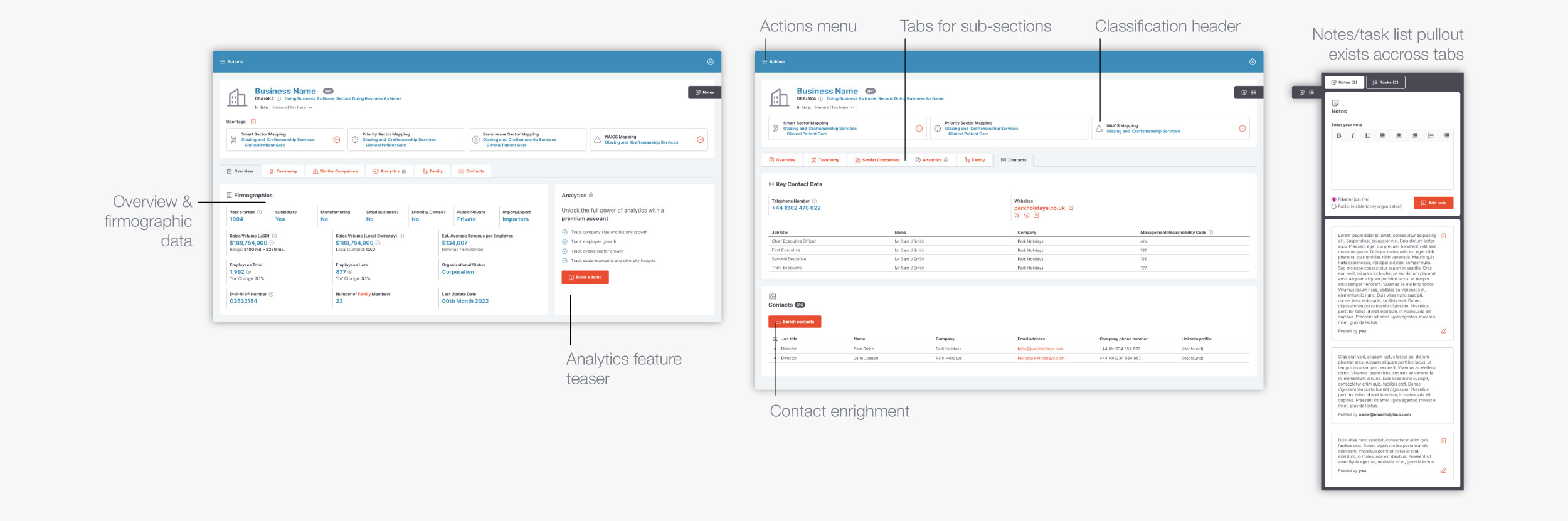
As a secondary layer of information, each business was also given a layout so that a user could dig into an individual business in order to inspect relevant data, explore the business family, the classification taxonomy and multiple other fields that were associated with the business.
It was also possible to utilise a scraping mechanism to find other appropriate contacts via LinkedIn.
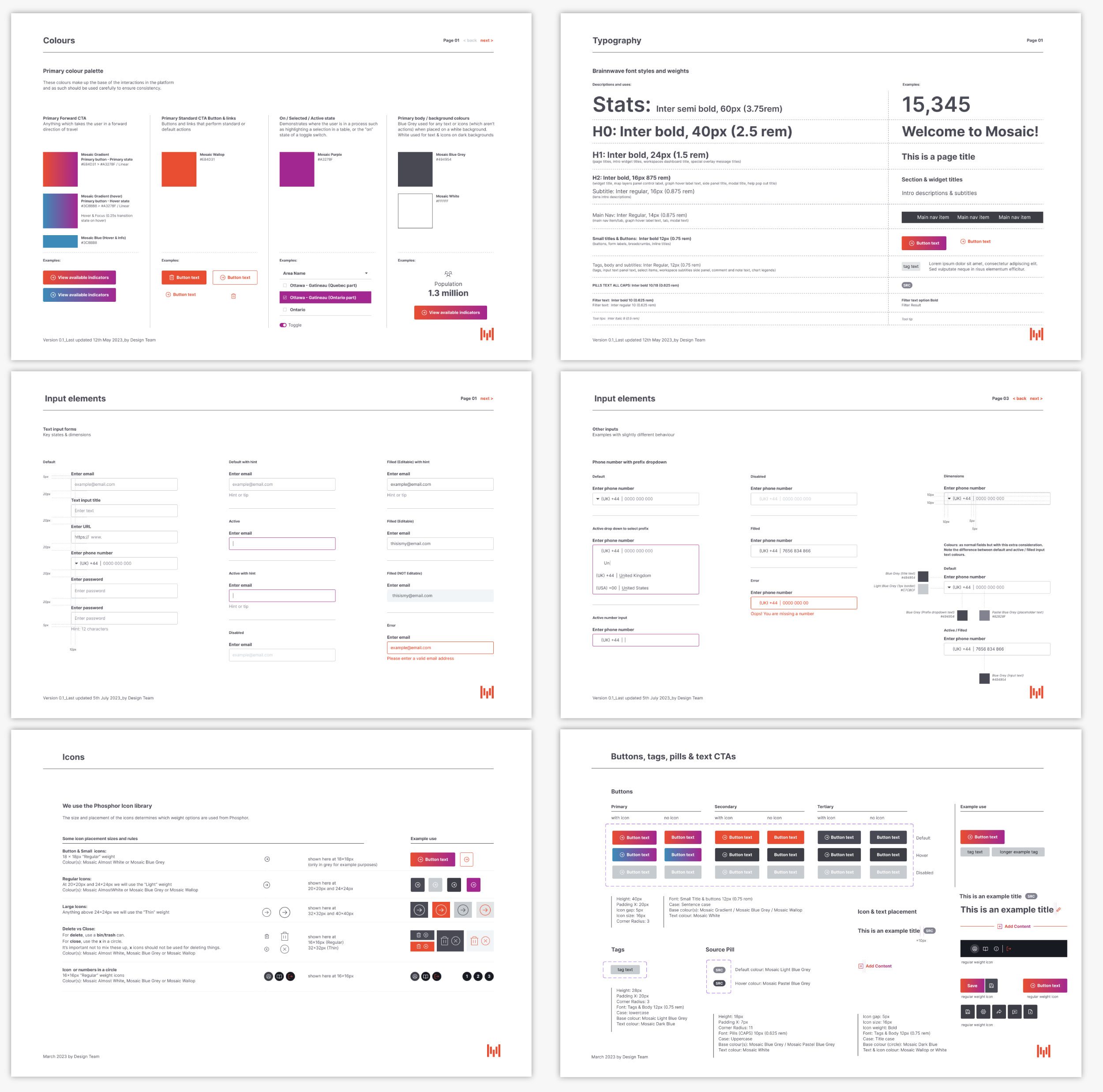
With the complexity of the platform designs and the requirement for something of a data-agnostic approach it made sense to set up design rules and a system for various elements.
These were built and maintained in Figma, through use of variables, options and multiple iterations of layout modes.
Despite the complexity, the scope and the challenges posed by such a large project, we successfully built Mosaic and were able to iterate on it every 2 weeks.
The platform would regularly receive praise from clients and prospective users for it’s intuitive UI and design.
Clients love how it looks and feels, and I think he’s managed to bring usability and clarity to a conceptually complex product.